Heemskerk
Heemskerk is a well known Dutch brand of table tennis tables and bats. Lately, they have been improving their business by introducing new products with better marketing strategies. I have been collaborating with Heemskerk for 2 years, designing packagings, advertisements and general deliverables for them. In this specific case, I have been asked to design the top quality Heemskerk table tennis bats.
Challenge
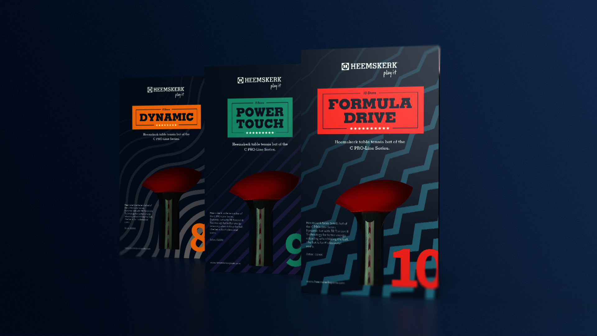
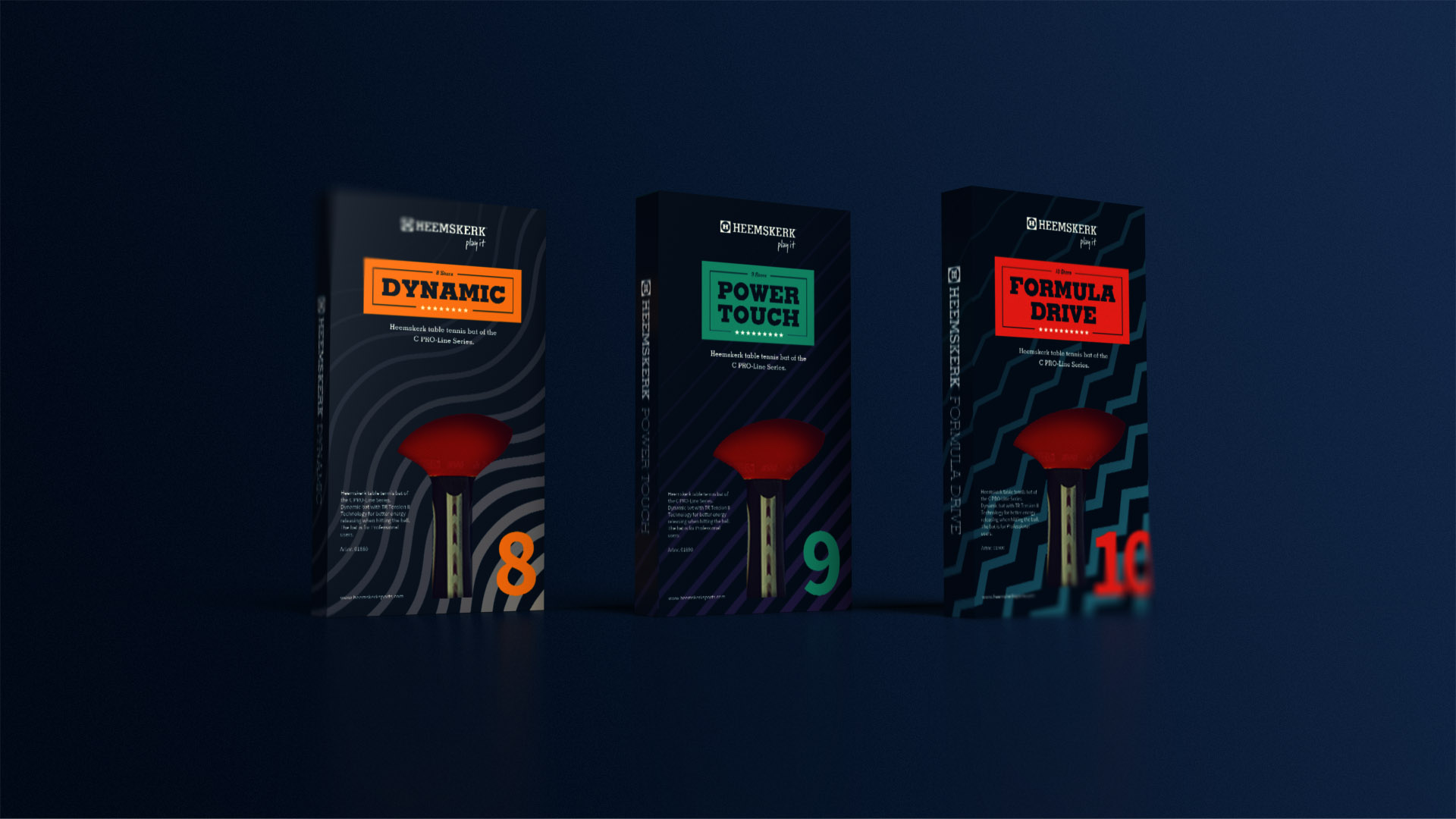
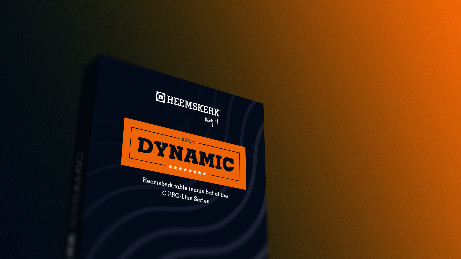
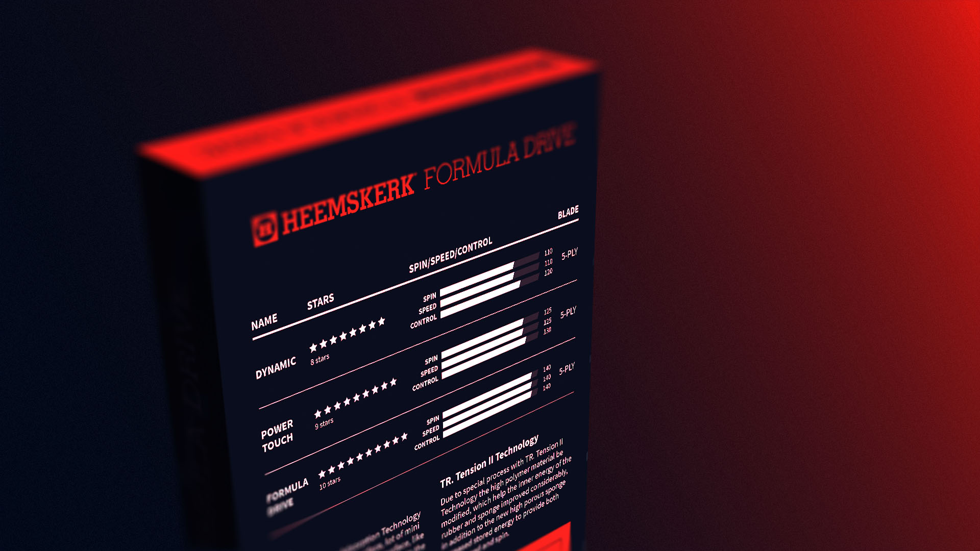
Heemskerk wanted to introduce a new kind of high-quality table tennis bats. Of course, it was necessary to design packaging to promote them. The challenge was to design dynamic and prime quality looking packaging for 3 different models of the same category
Solution
I decided to base the design of the Heemskerk Pro-Bats on 3 specific characteristics:
Heritage of the 50+ years old brand Since Heemskerk is a well known historic brand, I decided to use the same font and voice tone of the existing brand so that the customers can always recognize the brand.
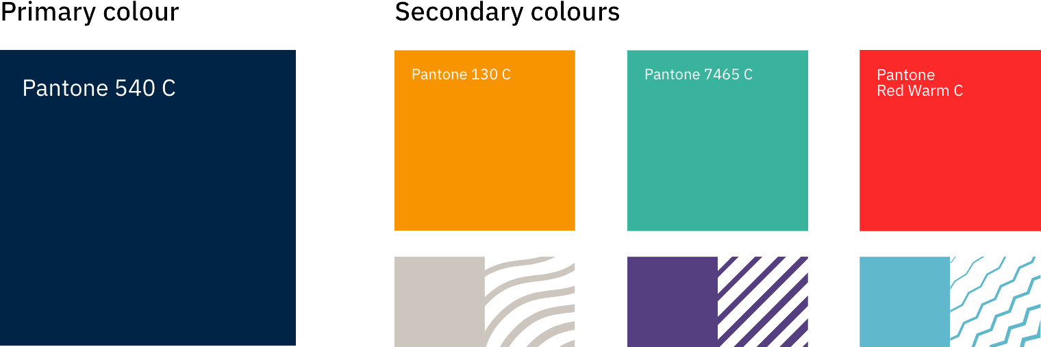
Consistency The 3 packaging boxes need to appear as part of the same category. To accomplish this requirement, I designed a common layout and background colour for the 3 bats. In order to distinguish the 3 bats belonging to the same product line from each other, I selected 3 secondary colours and 3 different patterns for each bat.
Dynamicity and Prime quality In order to give a sense of prime quality to the product, I chose a dark, but vibrant Pantone 540 C. Additionally, to complete the look and feel of the packaging, I included dynamicity by designing 3 different patterns for each bat.

Previous Project
Scovas


Next Project
Turing Society

