Challenge
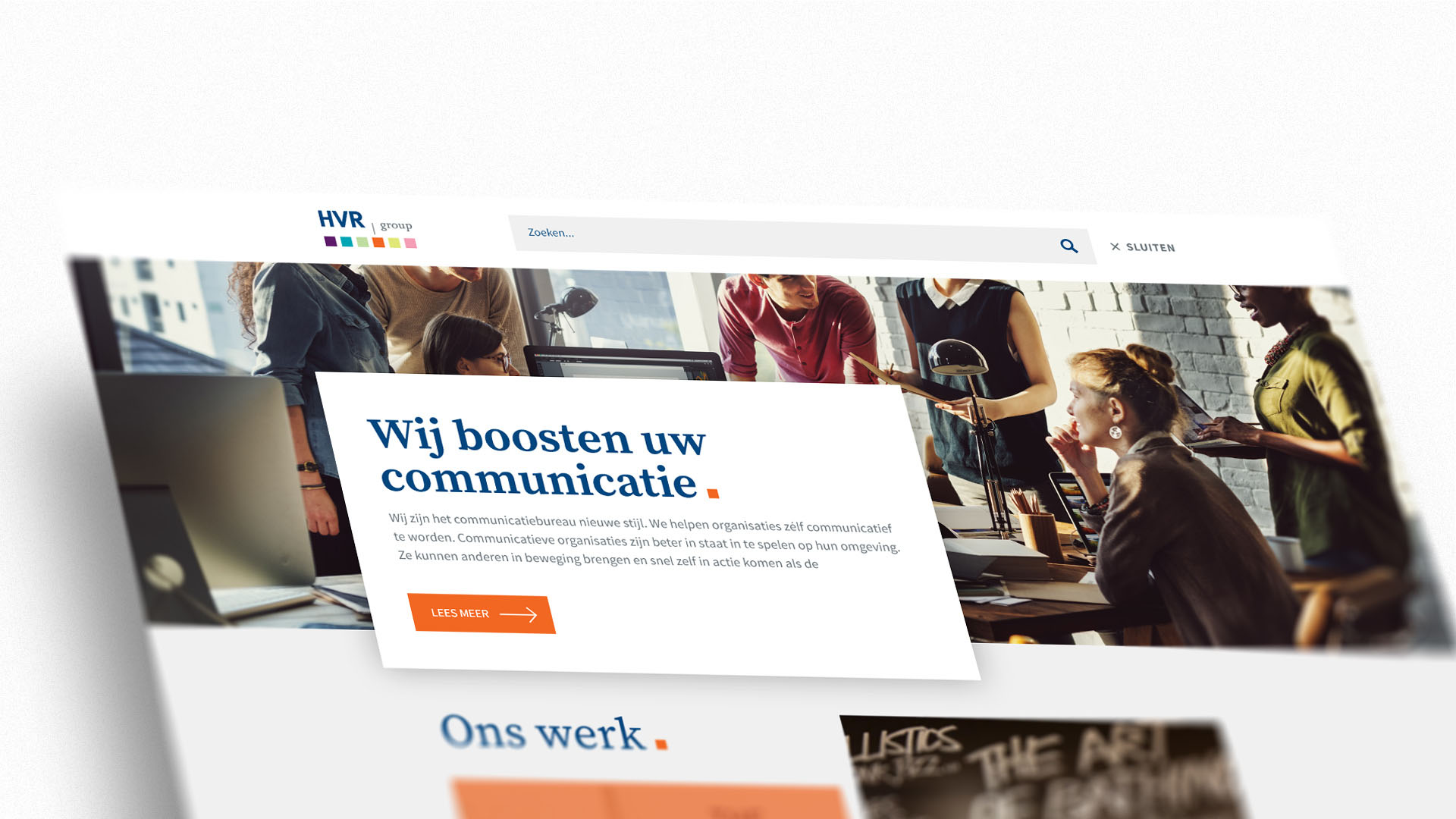
The old HVR was no longer meeting the needs of the users, because of the not intuitive interface and the messy information architecture. Due to the negative user experience, it was necessary to redesign the interface from scratch.

Solution
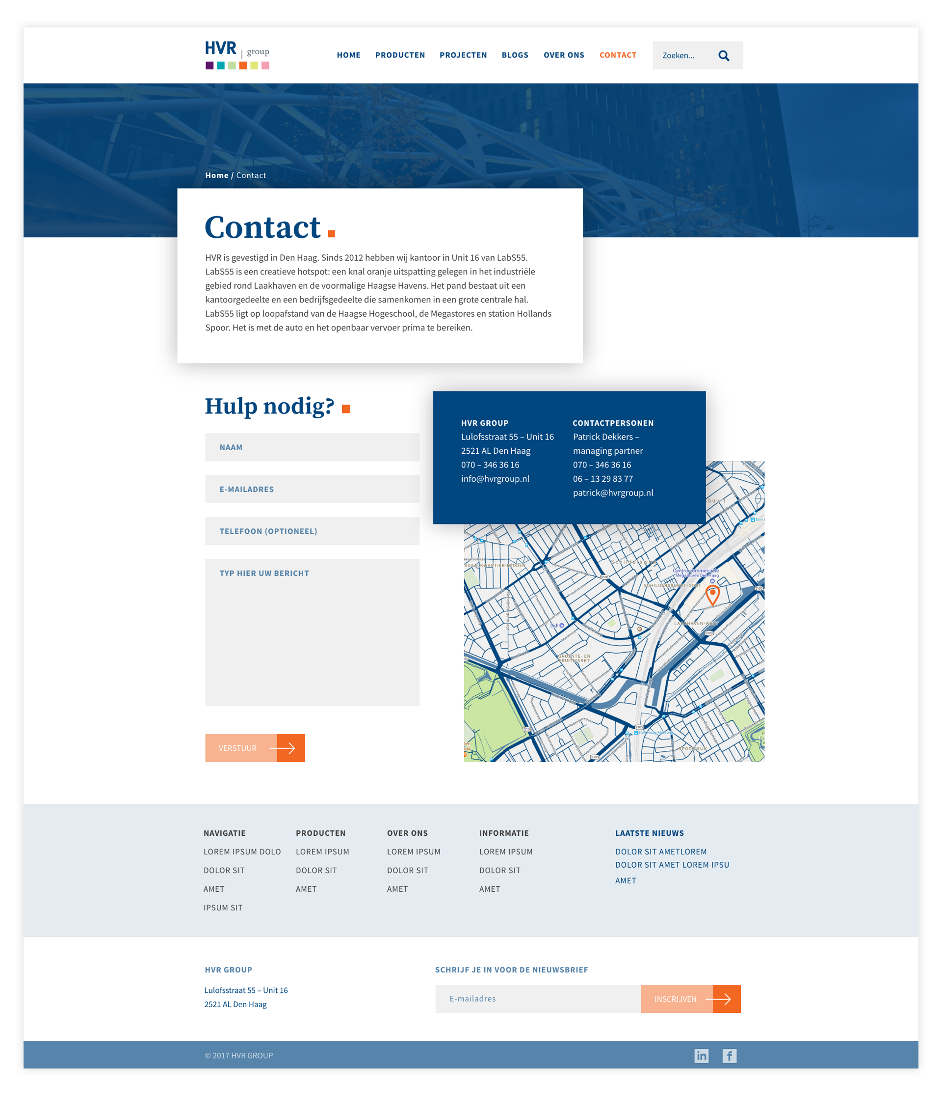
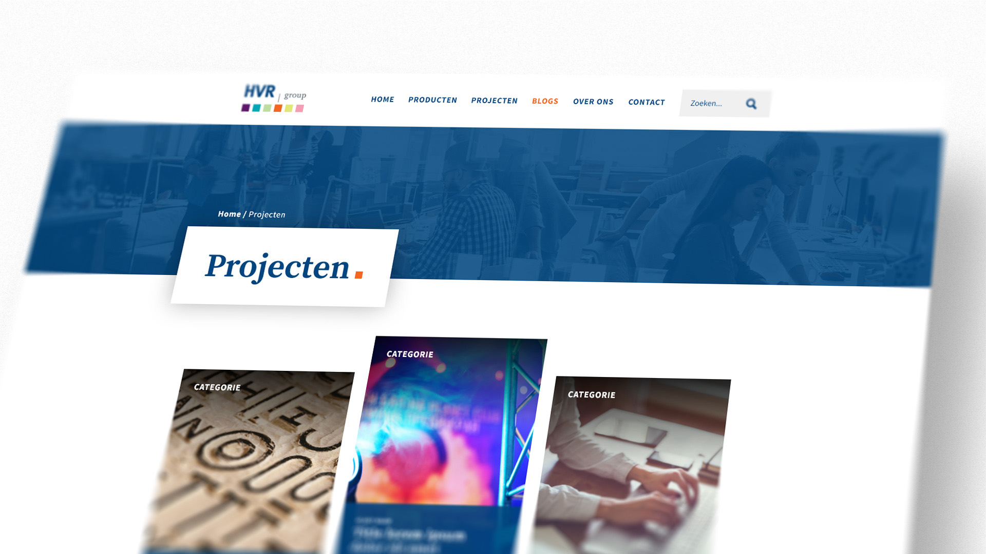
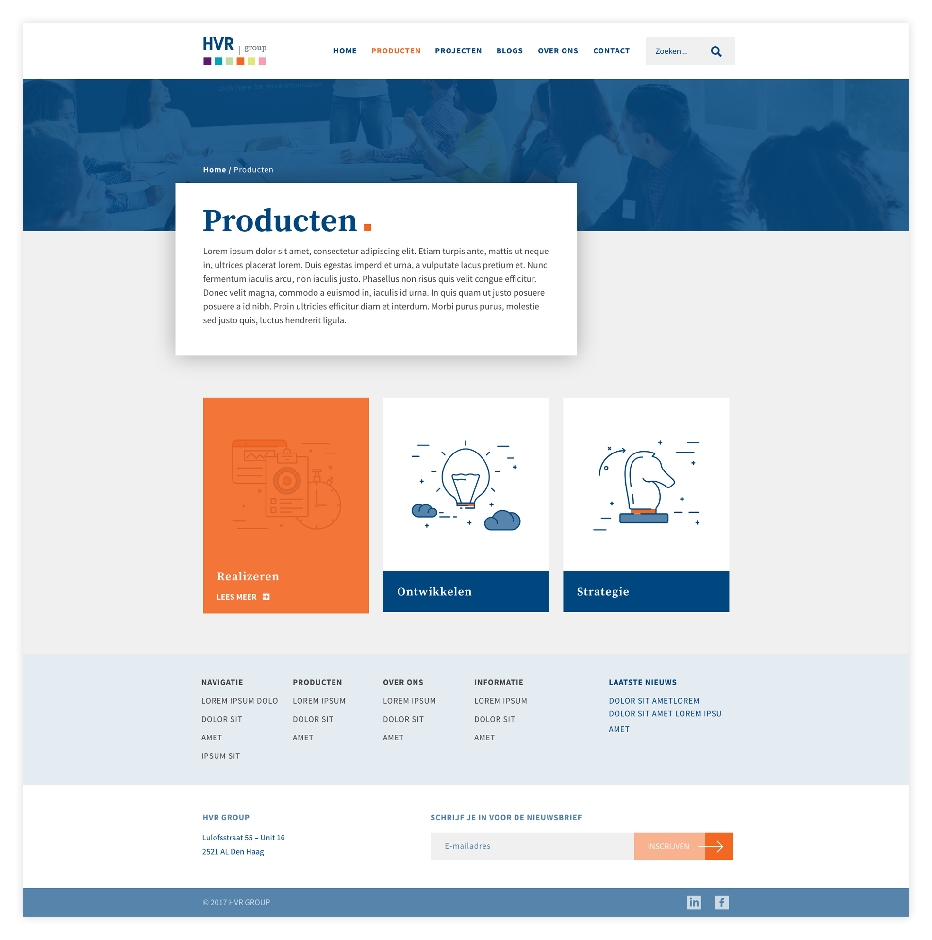
After analysing the old website and listening to the feedback of the HVR team, I designed a new interface for their website. I decided to use elements taken from the logo, like the squares and the combination of the serif and a sans serif typefaces.
Result
Half a year after the delivery of the website, we compared the data of the previous website with the new one. The bounce rate of the homepage dropped from 57% to 44%. The amount of visitors that actually contacted HVR increased of 52%. Sessions that lasted longer than 3 minutes increased by 96%, proving the efficiency of the new website.


