Challenge
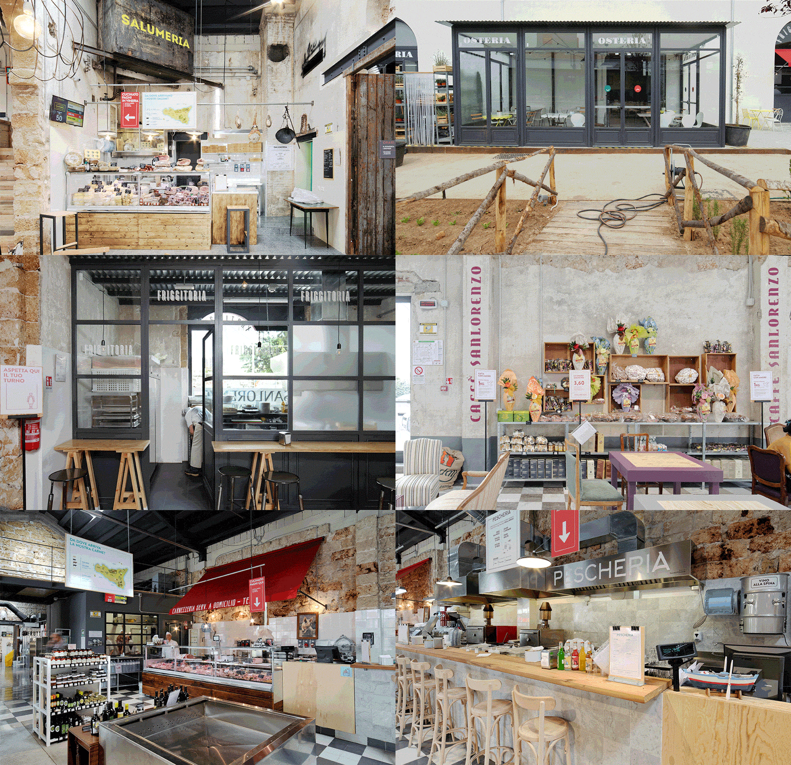
In Sicily there are plenty of places where people can enjoy authentic local food. However, before Sanlorenzo Mercato, there was no place where people could experience traditional food from the whole island without moving from town to town. The role of Sanlorenzo Mercato it is to concentrate the culinary heritage of the entire region in a single location with 11 different boutiques and restaurants, and hosting special events. One of the challenges was to design a visual identity that could communicate this unique brand.
Solution
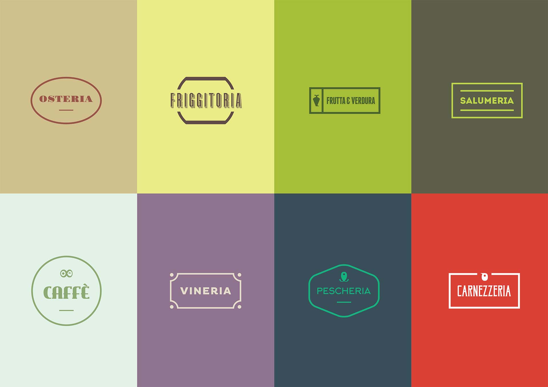
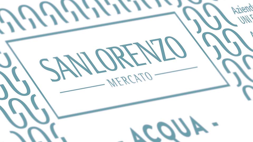
To design the visual identity of Sanlorenzo, I worked together with Alessio Varvarà, using the design thinking approach. Our inspiration was the traditional Market of Palermo, a chaotic world full of sounds and colours. We decided that chaos would be the starting point of our project. However, we had to control this chaos in order to make a strong and recognizable brand. We divided the visual identity into 2 main blocks, the Market and the boutiques. For the Market we made a simple and recognizable identity for all the deliverables to convey the sense of inclusion of all the boutiques. For the boutiques, we used the opposite approach: in traditional markets, every shop is different, with its own style and identity; similarly, we wanted to express the uniqueness of each boutique by creating 11 different identities.


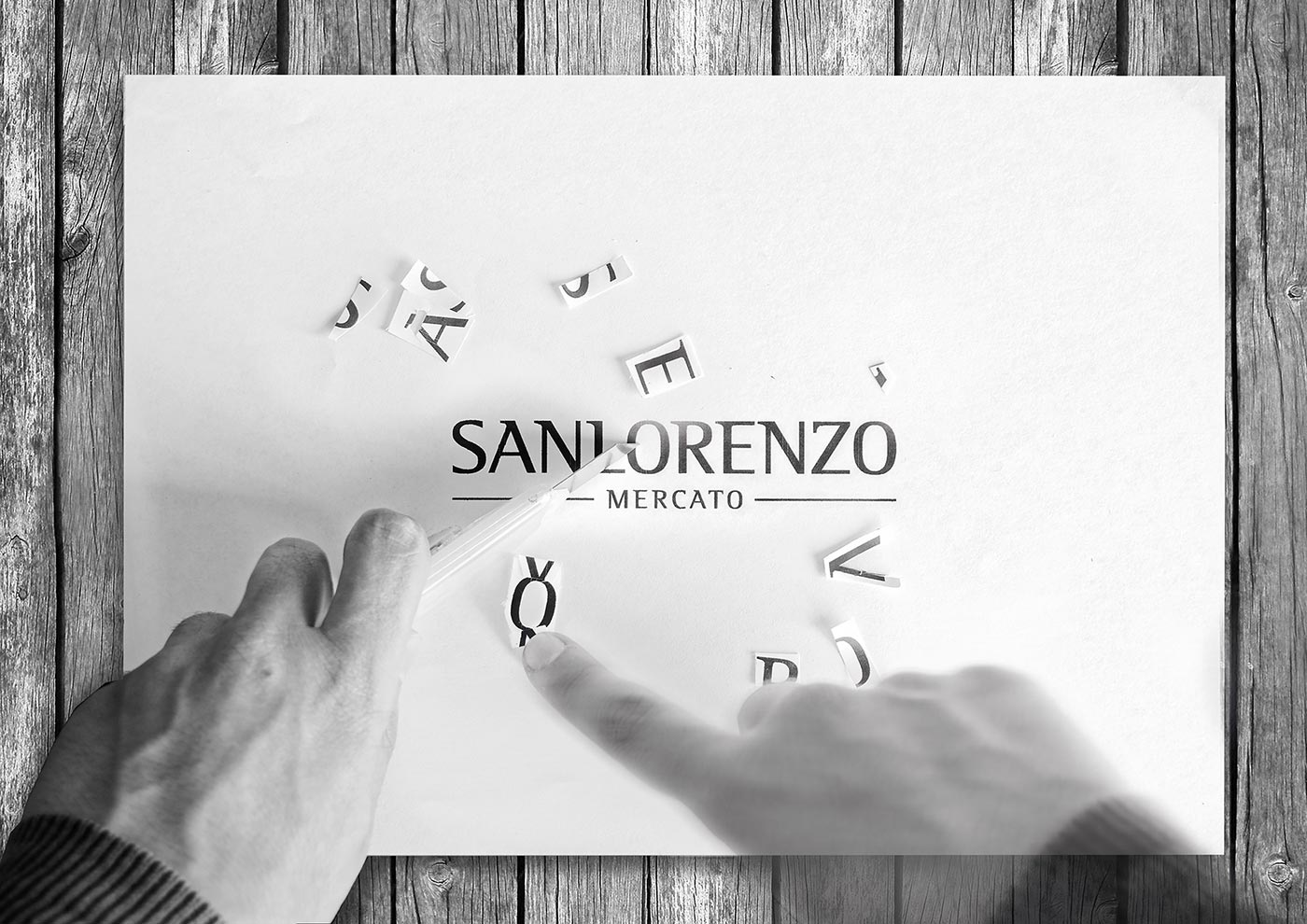
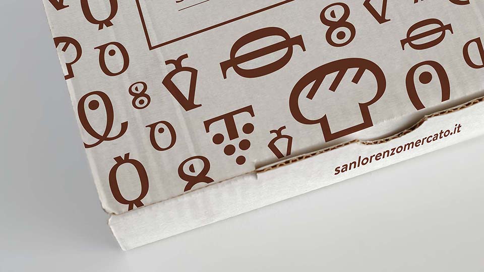
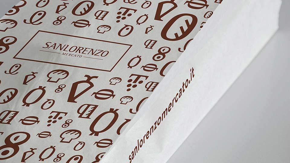
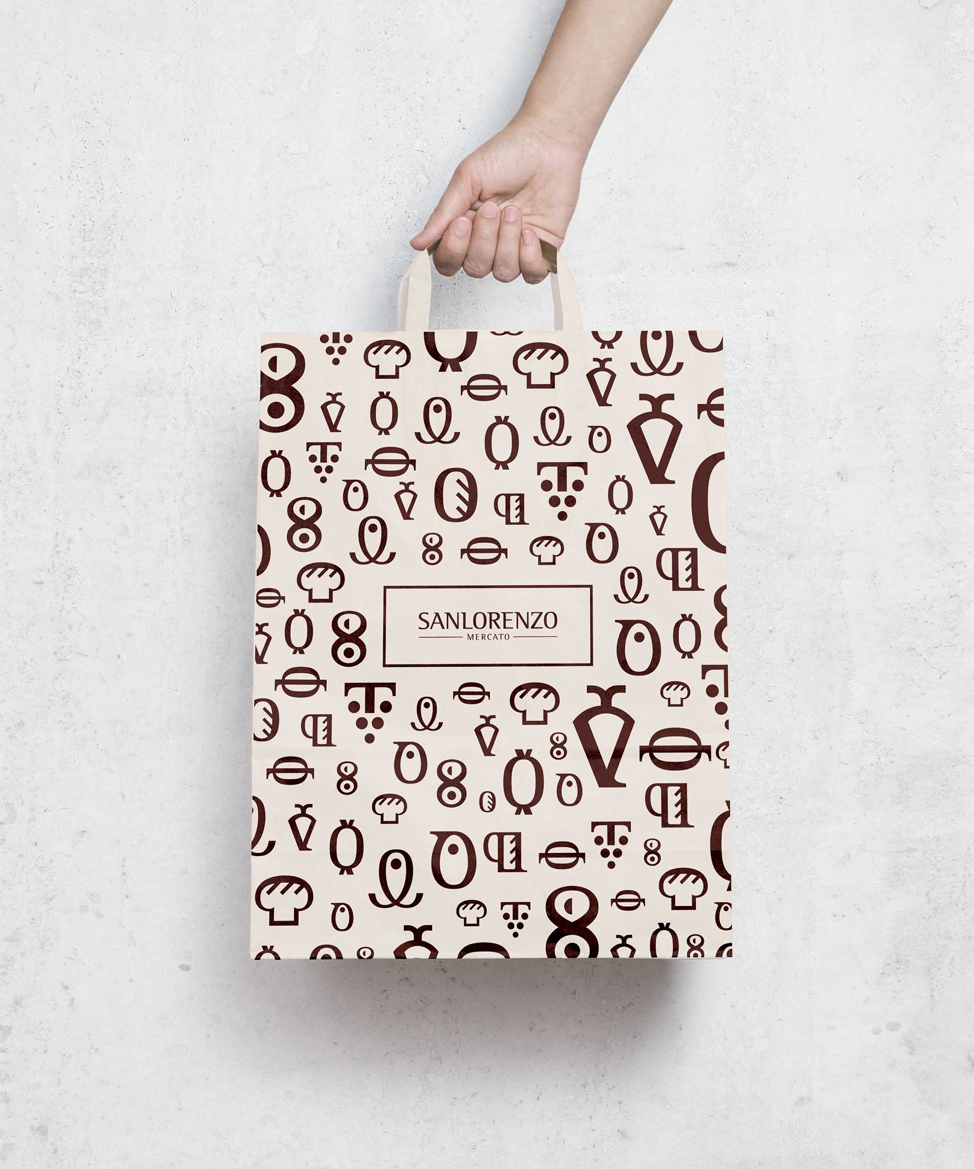
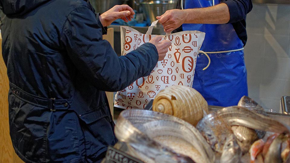
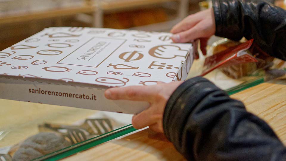
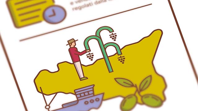
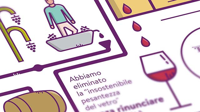
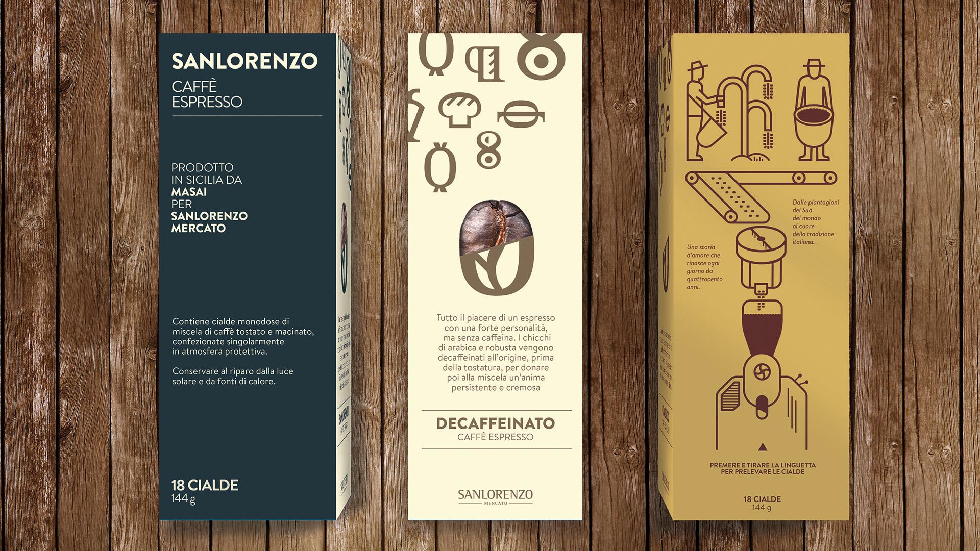
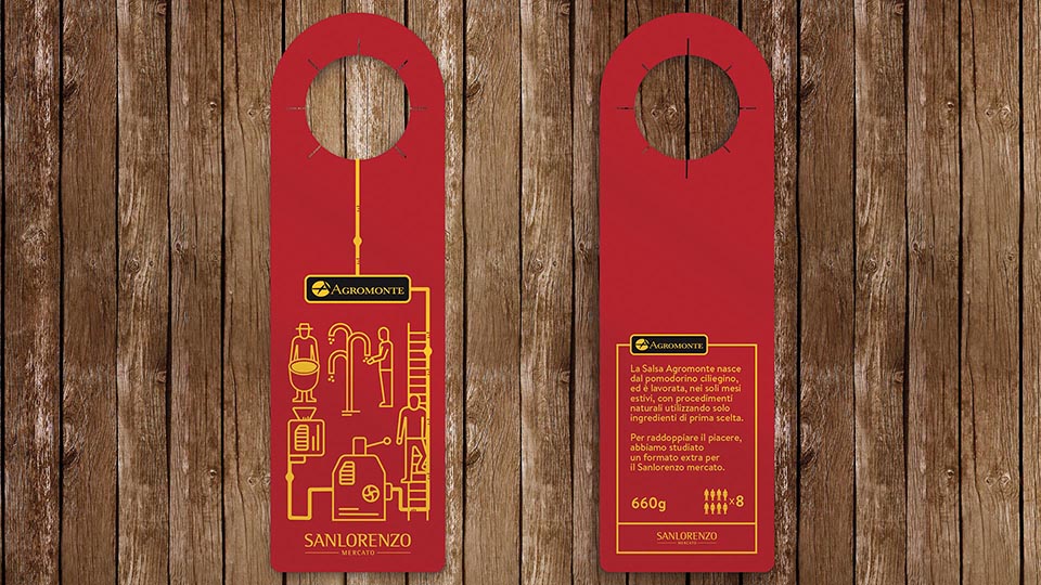
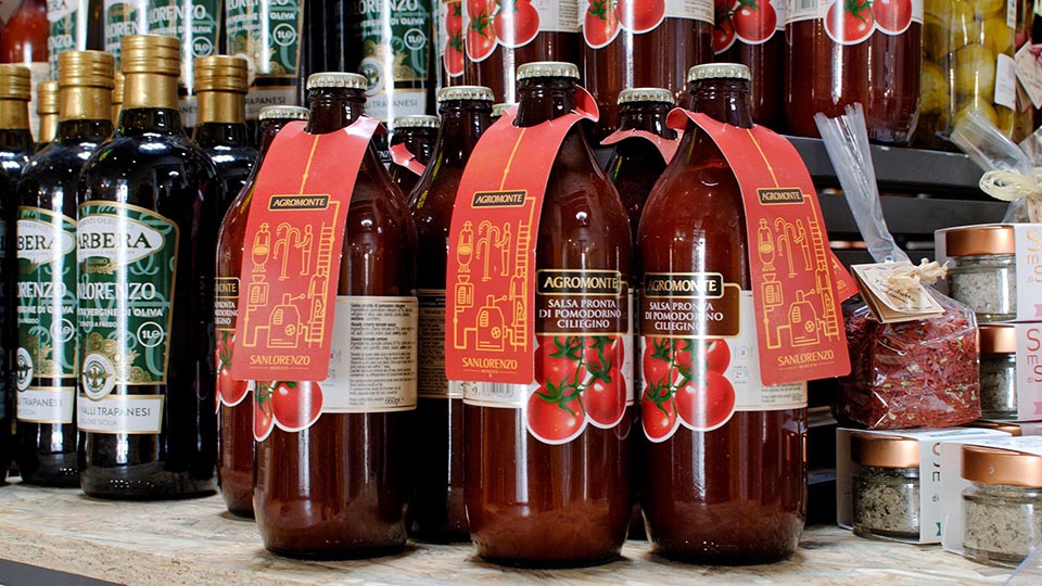
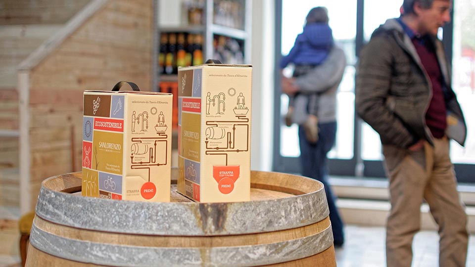
Our on-site visit at the local markets inspired us for the choice of the main typeface for the Market: Brandon Grotesk, a modern geometric typeface. For the boutiques, we selected 11 different typefaces. We also designed 11 logos composed by a logotype and symbols. To design all those symbols we literally cut all the letters of the logo of the market and combined the pieces to make iconographic elements that represent the products of every boutique. To stress that all the boutiques are part of the market, we made a pattern with all these iconographic symbols and use it in all the deliverables of the market (packaging, advertisement, ect.).
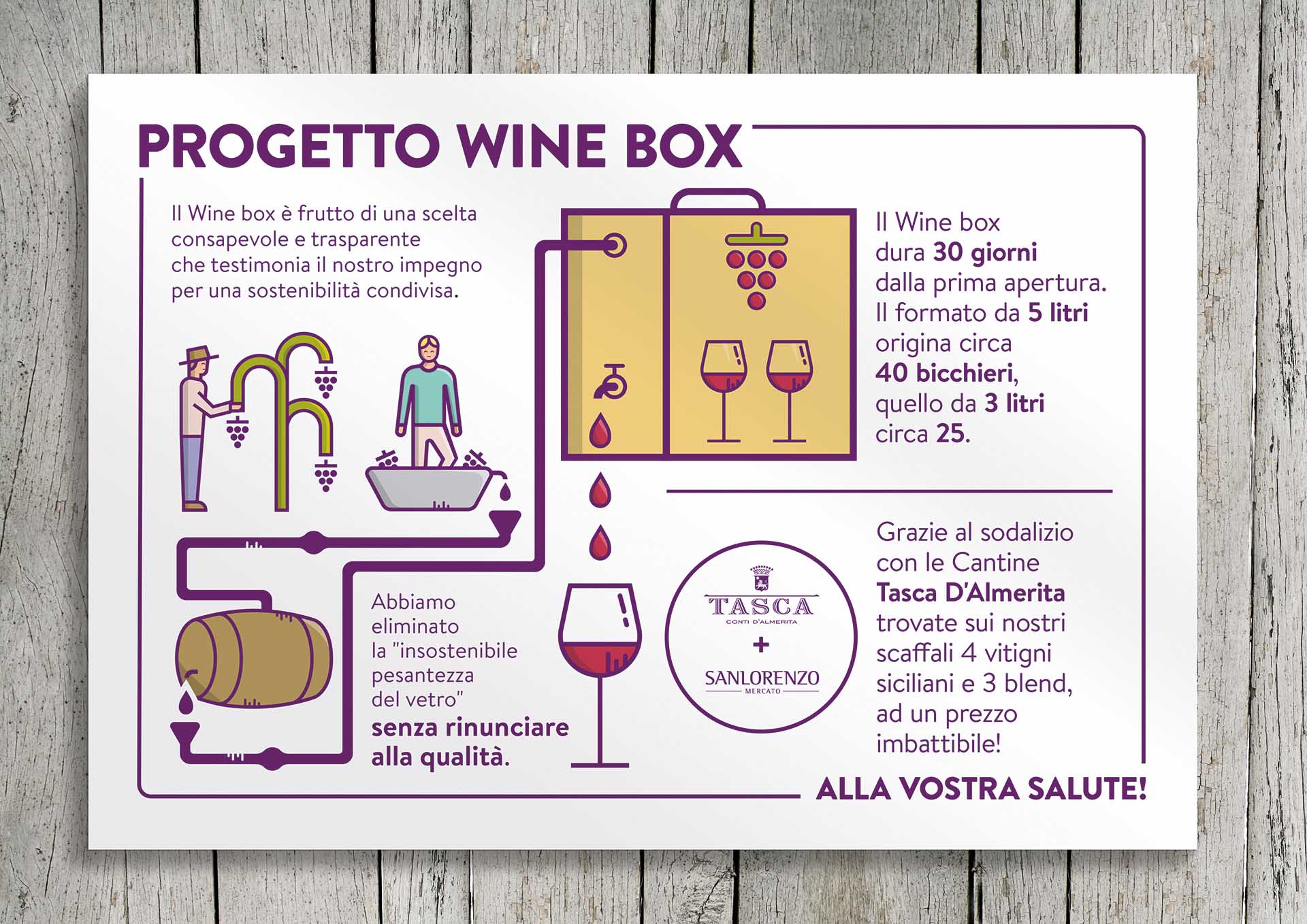
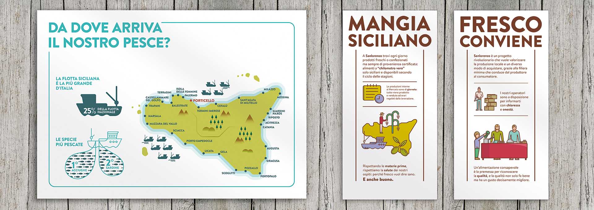
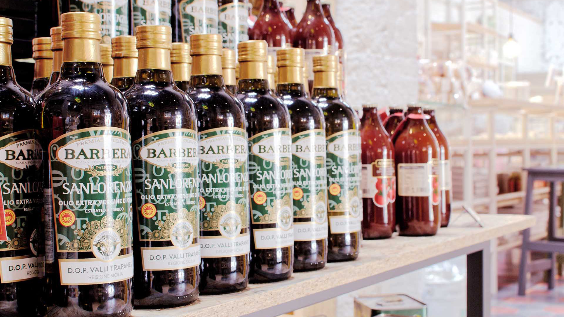
Once completed the visual identity, Alessio Varvarà left the project and I continued to collaborate with the startup for an entire year, designing daily advertising, visual content for social media and other deliverables like packagings and brochures.



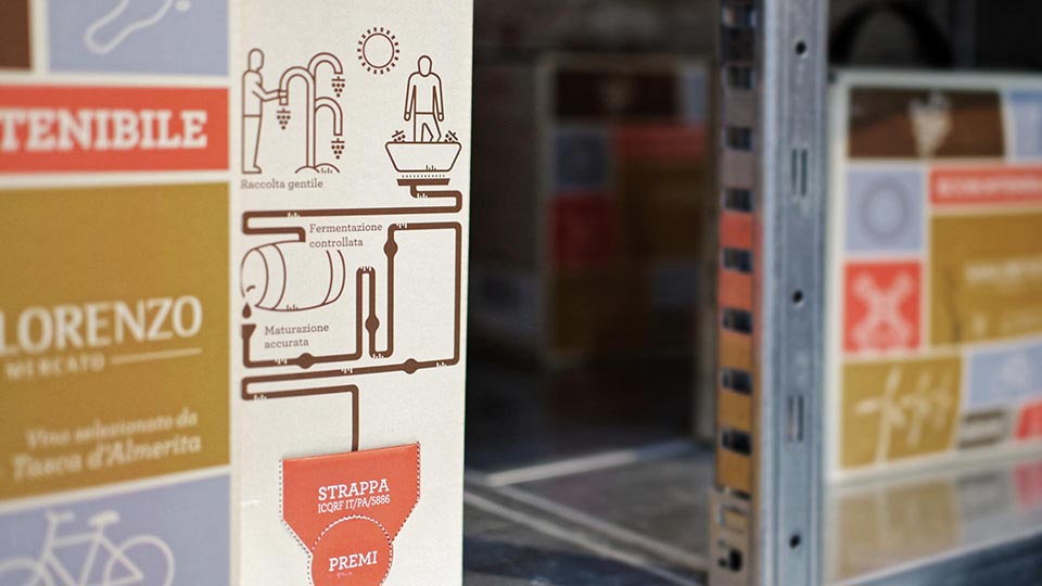
The Result
DMy work contributed to make the market a unique and authentic place where every day thousands of people spend their time having dinner with friends, go shopping at the market and attend events about Sicilian products. For me it was a great pleasure to be part of this project, and I am proud to see that the thousands of customers of the Market (still now) buy goods whose packaging is my own product.
My Role
I was involved in 2 different phases of the project. In the first phase, I designed the entire visual identity with Alessio Varvarà; in the second phase, my role was to design visual content for social media and deliverables such as packaging, brochures and advertisement.


